
Tools by ABPZUS Coffee — internal
DBI icon

100

In Progress

District Business Intelligence

ABP · Mohamad Zulfaiz Rofi

How every district and outlet is actually performing, on one screen instead of 63 tables.

DBI's Outlet Overview. Six KPI tiles across the top — order prep time, product attach rate, Google rating, sales per day, expiring in 7 days and scheduling cost — then a map of Malaysia with every outlet as a dot, a list of outlets needing attention on the left, and a district's outlet list on the right. The two money tiles and the district manager's name are blurred.
The real app on real outlets. The money figures and the district manager’s name are blurred — this page is readable by anyone inside ZUS.

Why it exists

The job it takes off someone

The answer to “how is this district doing?” lived in 63 Lark tables, one per District Manager, and you could only read it if you already knew whose table to open. There was no view across districts, and none for the people whose job is exactly that comparison. DBI puts every outlet on one map and one set of numbers — service, sales, stock and roster — so the comparison is a filter, not a hunt.

What the current build covers

On hold for data. DBI read everything from a Supabase database that was retired on 6 October 2026. The app still opens and every screen is there, but each one is empty until a new data source is chosen, and sign-in will come back as Lark SSO. The screenshots below are from before that.

Who it is for

Three people open this

If none of these is you, it is probably not the tool you want — say so on the form and ABP will point you at the right one.

VP of Operations and her team

One place to compare districts and find the outlets that need attention, without asking anyone for a sheet.

District Managers

Their own outlets, scored against each outlet’s own target, with the reason each one is flagged.

Strategy and Supply Chain

PAR targets set in the app rather than in a spreadsheet, and stock that is about to expire, by outlet.

Documentation

How to use DBI

The main screen, in the order you read it. Both screenshots are the real app with the money figures blurred.

1

Outlet Overview

Everything about an outlet on one screen — service, sales, stock and roster. Pick a district at the top right, or leave it on every outlet. The tiles count what is off target; the map and the lists say where.
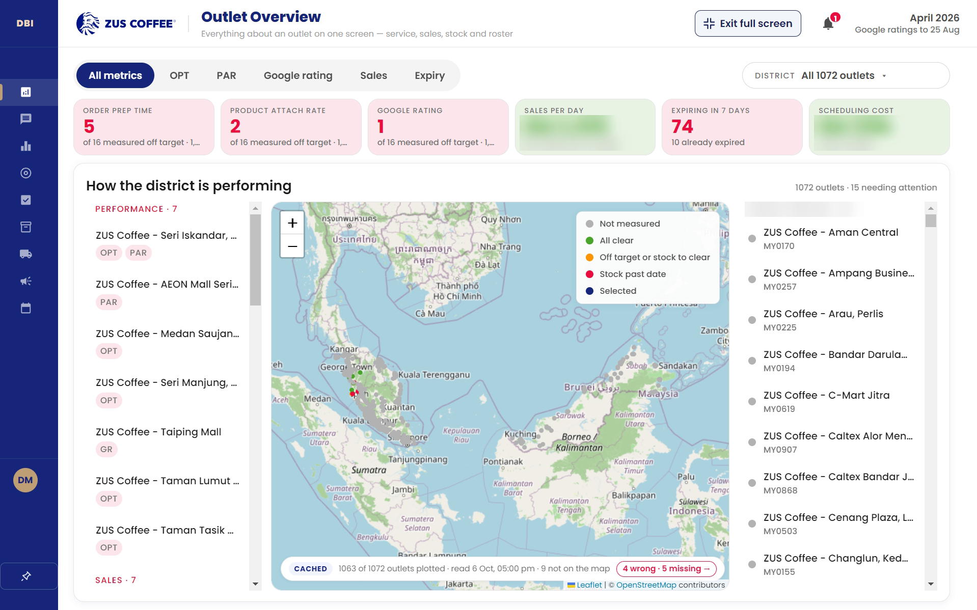
The Outlet Overview screen: KPI tiles, a map of outlets coloured by status, outlets needing attention on the left and a district's outlet list on the right. Money tiles and a manager's name are blurred.
Grey is not measured, green all clear, amber off target or stock to clear, red stock past date.
  • Performance — Outlets off target on order prep time, product attach rate, PAR or Google rating.
  • Sales — Outlets selling below their target.
  • Expiry — Stock at or past its date.
  • Scheduling — Outlets whose roster costs more than it should.
2

Google Rating, Week By Week

Each outlet’s Google rating as a weekly snapshot against its target, with the gap and a plain label — Below, On Target or Strong. The calendar strip above marks school breaks and public holidays, so a dip has its context next to it.

The Google rating view: a calendar strip with a school break and two public holidays, then a table of outlets with their target, four weekly ratings, the gap against 4.00 and a status label.
Google ratings are public, so these are shown as they are. Money tiles are blurred.
3

The Other Screens

The rail on the left holds the rest. Each is one question, answered for every outlet at once.

  • Leaderboard — Every outlet in order, scored against its own target.
  • PAR Targets — The target each outlet is graded against — set here, not in a spreadsheet.
  • Scheduling — The outlet roster, from FOSS, inside the same window.

Limits worth knowing

What DBI is not

Written down because it is cheaper to read this now than to find it out in front of someone.

  • It is not real-time. It follows a weekly fetch; freshness is set by that, not by any event.
  • It is not where reviews are fetched. It reads what the pipeline lands and never touches the source systems.
  • It is not a place to edit outlet records. The outlet list is maintained elsewhere and read here.
  • It is not connected to the OGMR Lark Base, and holds no token for it.

Who made it

Credits

Developer

Mohamad Zulfaiz RofiMain developer · ABP

Published by

ABPZUS Coffee — internal tools

No other contributors are recorded for this one. If you worked on it and are not here, tell ABP — it is an omission, not a judgement.

The details

App info

Version
Not released yet
Updated on
2 October 2026
Download size
No build to download yet
Installs
Not counted
Project code
100

Requires — Windows

Windows 10 or newer, 64-bit.

Data safety

What it does with data

Written so you could check each line rather than take it on trust. If one of them turns out to be wrong, that is a bug in the tool, not a wording problem here.

  • Reads outlet, Google rating, sales, stock and roster figures. Nothing is written back to the source systems.
  • Sign-in is being moved to Lark, so access stops when a Lark account is switched off.
  • Map tiles come from public OpenStreetMap servers, which see map areas but no outlet figures.

Before you ask

Questions people actually send

Why is it empty when I open it?

Because its database was retired on 6 October 2026 and a new source has not been chosen yet. Every screen is built; it has nothing to show until then.

Will it need a password?

No. Sign-in is moving to Lark, the same as the other ABP tools.

Developer contact

Support

Message ABP in Lark. That is the fastest route and it reaches whoever is closest to the problem.

Maintained by

Mohamad Zulfaiz Rofi, ABP

Where the source lives

Internal, on the ABP machines. There is no public repository and no third-party code hosting for any tool on this site.